 The interface between sound and maps raises a few different possibilities. Are you trying to display sounds with visual symbols (like in the graphic on the left), display visual features with sounds, or incorporate actual sounds to represent themselves in the map? Or can we use sound to include additional data and expand the range of information that is displayed to the reader, through the use of tools like audio narrations? Data is not always static, and sound can be an especially important tool for displaying temporal information.
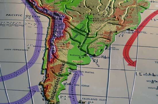
In the case of people with visual impairments, using sound to represent spatial information can greatly expand the accessibility of maps. Sound, as well as other sensory information, may help mapmakers move beyond the tactile map, which is for many blind people the only cartographic resource available to them. In most cases, people require a great deal of training or assistance from a sighted person to properly orient these types of maps. They are essentially flat paper maps with the features turned into raised lines, and without any meaningful representation of the many other inputs that blind people (and sighted people)
 use to navigate the world. Finding a way to map these inputs may help people develop what the geographer Dan Jacobson refers to as a Personal Guidance System to enable them to move more freely in their environment (for a brief bibliography on this topic, see the end of this post.)
I was inspired to write about this because I have come across a few things of late that make intriguing use of sound in maps. My girlfriend also teaches elementary schoolchildren with visual impairments, so I have been trying to read up on the subject. She teaches them about the history and geography of New York City, so she is always looking for new ways to display geographic features and improve their spatial cognition.
The first item I will point to is a map produced for the Lower East Side Tenement Museum in New York City. The project is called Folk Songs for the Five Points, and the map links locations to sounds recorded at the particular site. The sounds are also categorized into four different types - field recordings, spoken word, music, and folk songs - and the visitor can mix them to create their own song that captures the cacophony of the Lower East Side.

The second was an episode of This American Life that aired earlier this year that explored mapping with different senses. The second act considered hearing, and the contributor attempted to isolate all the ambient sounds of his environment, and then figure out what mood they conveyed when in harmonic combination. The first segment of this program features the work of geographer Denis Wood, who co-authored with Krygier the book Making Maps: A Visual Guide to Map Design for GIS. The project that is mentioned in the piece can be seen here.
Most of these intriguing developments in mapmaking and visualization require the use of digital resources, so the possibilities for online multi-sensory cartography are immense. People encounter maps most often in the news media, and increasingly they get their news online. So let's hope that the massive layoffs that are sweeping through the press won't hamper these fascinating new possibilities in mapmaking, or the cartographic profession in general - you know things are bad when even National Geographic is laying off cartographers.
Bibliography
Dransch, Doris (2000). "The Use of Different Data in Visualizing Spatial Data." Computers and Geosciences 26(1): 5-9.
Jacobson, R. Dan (1994). "Navigation for the Visually Handicapped: Going Beyond Tactile Cartography." Swansea Geographer 31(1): 78-85.
Krygier, J.B. (1994). "Sound and Geographic Visualization." In Taylor, D. and A. MacEachren, eds. Visualization in Modern Cartography. New York: Pergammon.


Have you seen the documentary Helvetica? The film traces the design, adoption, and backlash against the signature font of modernity (think of the text on NY Subway signs or the logo of Crate and Barrel / the Gap). If cartographers are half as colorful as text designers, then I think you could make a wonderful sequel.
ReplyDelete